Estimated read time: 2-3 minutes
This archived news story is available only for your personal, non-commercial use. Information in the story may be outdated or superseded by additional information. Reading or replaying the story in its archived form does not constitute a republication of the story.
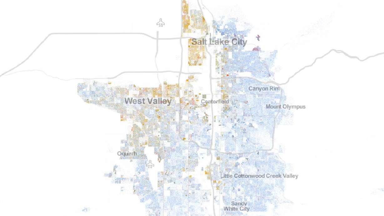
CHARLOTTESVILLE, Va. — A new interactive map produced by The Demographics and Workforce Group at the University of Virginia outlines the population of the United States based on race and ethnicity. The data was taken from the 2010 Census and each individual listed in the census is represented by a small dot on the map.
The map was created by Dustin Cable, a senior policy researcher and statistician for the Demographics and Workforce Group. He used census data to collect information regarding race population density areas in the U.S. Using that information, he created an interactive map. Each of the 308,745,538 dots represent the locations of United States residents based on where they were living at the time the census was written.
Each racial group is denoted by a different colored dot. The map is designed in a way to allow the user to zoom out and see a large array of data and color swaths, or zoom in close and see race and ethnicity information for individual geographic areas and neighborhoods.
"Each of the 308 million dots are smaller than a pixel on your computer screen at most zoom levels," according to the website for the map. "Therefore, the ‘smudges' you see at the national and regional levels are actually aggregations of many individual dots. The dots themselves are only resolvable at the city and neighborhood zoom levels."
From a bird's-eye view, many areas on the map appear to have large areas of racial integration. Some cities, however, separate more distinctly into various race groups the closer they are examined. Detroit is one of the more stark comparison, with the line between white residents (represented by blue dots) and black residents (represented by green dots) separating dramatically across the famous 8 Mile Road.


