Estimated read time: 6-7 minutes
This archived news story is available only for your personal, non-commercial use. Information in the story may be outdated or superseded by additional information. Reading or replaying the story in its archived form does not constitute a republication of the story.
SALT LAKE CITY — The Utah Jazz have had a recent explosion of popularity, spurred by back-to-back Western Conference semifinal appearances and the emergence of Donovan Mitchell, one of the league’s best and most exciting young players.
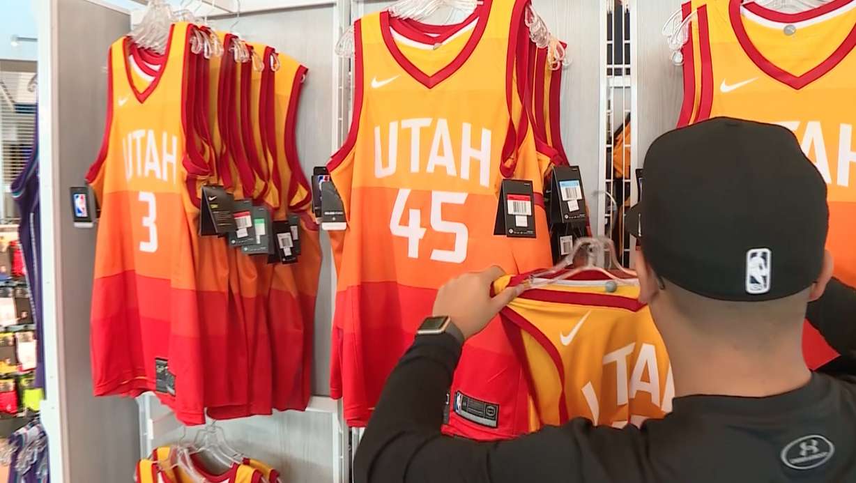
As a result, the Jazz are being highlighted more on national TV and with high-profile games. With that extra exposure, Nike, the NBA’s apparel affiliate, has created a new line of jerseys, including a yet-to-be-seen holiday jersey, which the Jazz will wear on Christmas Day as they host the Portland Trail Blazers.
With that in mind, I’ve gone back and looked at each era of Jazz uniform and ranked them from best to worst.
2017-Present

This is the golden era of Jazz jerseys. The team’s white Associate jersey and road icon jersey are clean, modern and feature the perfect touch of history to resonate with fans new and old.
The classic Jazz note logo, with an updated multi-color ball, both pays homage to the golden era of Jazz basketball in the '90s, while acknowledging the team's history in New Orleans.
The yellow Statement edition jersey presents a modernist reimagining of the Jazz logo, simplifying the look to only present the basketball note letter J, with the player's number below.
I, like most who saw it initially, needed time to warm to the team’s gradient striped City jerseys. But it has quickly become one of the league’s most ambitious and unique jerseys, highlighting the state’s unique colors from north to south.
This year, the Jazz add a throwback purple edition, the same jerseys they wore on the road from the mid '80s and through the '90s.
1979-1996
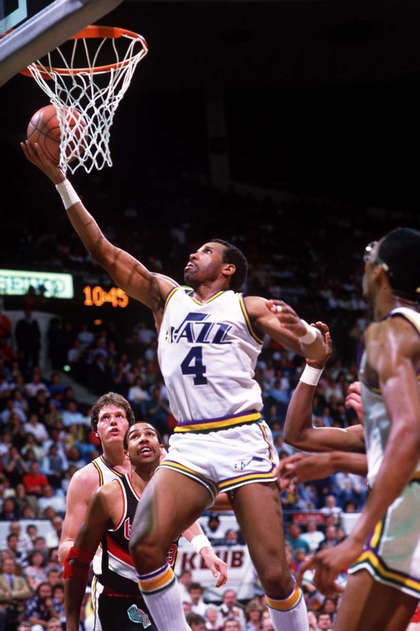
Technically, these jerseys could have been broken up into two different eras, as the Jazz had one color scheme from 1979 through 1984 and then 1984 through 1996. But the uniforms changed very little beyond color.
When the team moved to Utah, they wore the same jerseys they had during their tenure in New Orleans. Instead of a purple road jersey, they wore green. The home jerseys featured a purple, yellow and gold note logo, while the green road jersey featured a yellow and white note logo.
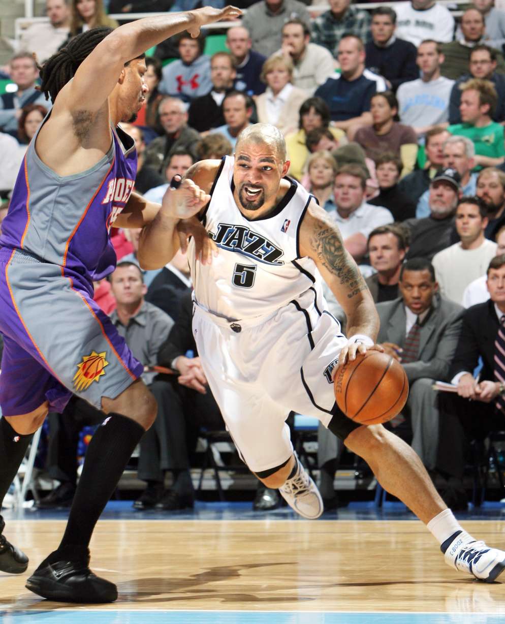
In 1984, the Jazz added the word Utah to the logo above the double Z on Jazz and switched from green road jerseys back to the purple. In my opinion, the home white jersey, with the multicolored ball might be the best uniform in Jazz history.
2010-2016
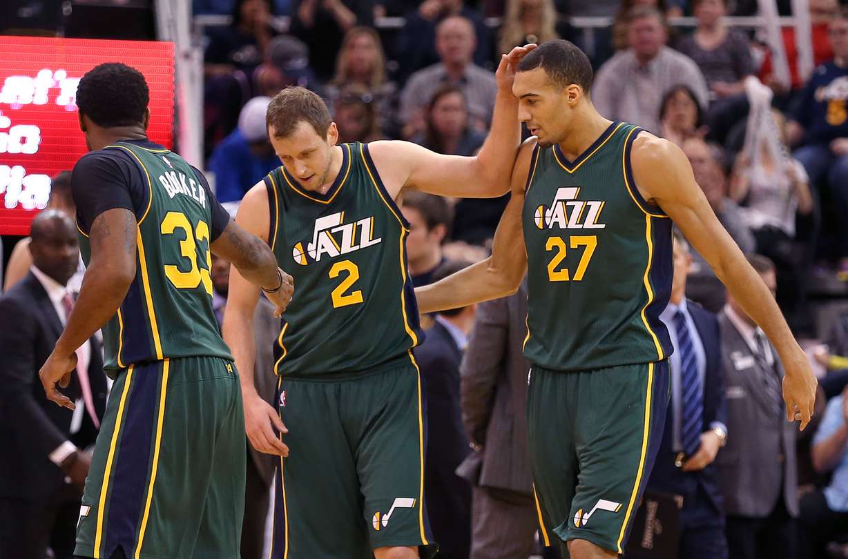
This era paved the way for the Jazz's modern selection of jerseys, which I ranked as the top grouping for the team. The team moved to a new color palette featuring blue, white, green and gold, laid over the mountain logo that debuted in the late 90’s.
While this era featured only three jersey variations — a classic home white uniform, a traditional blue road uniform, and a green alternate. I think the alternate is the best green jersey in team history.
The jerseys feature a bold stripe down either side of the uniform, which was unique to the era, and more importantly, signaled a change from the worst uniform era in team history.
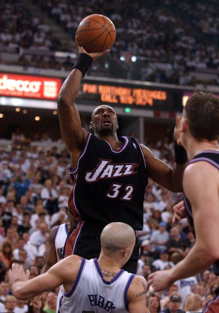
1974-1979
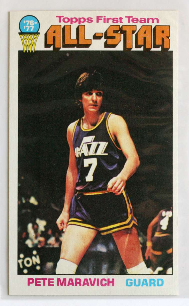
The jerseys that started it all deserve a special place in Jazz fans' hearts, and the lasting power of the original note logo through today is a testament to the strength of the initial design.
As mentioned earlier, the white home jerseys with the purple logo and multicolored basketball endured from 1979-1996 and might be the best jersey in team history. But the purple road jersey loses style points for featuring a purely white logo that looks hand drawn and is too bland for the team’s colorful culture, especially while they were playing in New Orleans.
1996-2004
1996 marked the beginning of a new era for the Jazz, moving away from the team’s note logo into a brighter, round basketball logo. The jerseys themselves featured a mountain range stretching across the chest above the team name and jersey number.
The white, purple and turquoise color scheme is anything but timeless but was fitting for the era. These jerseys could have ranked higher had the team not introduced a disastrous black and copper alternate in 1998. While the color scheme was a nod to the state’s copper mines, it featured little else in the way of creativity and was an overall eyesore.
2016-2017
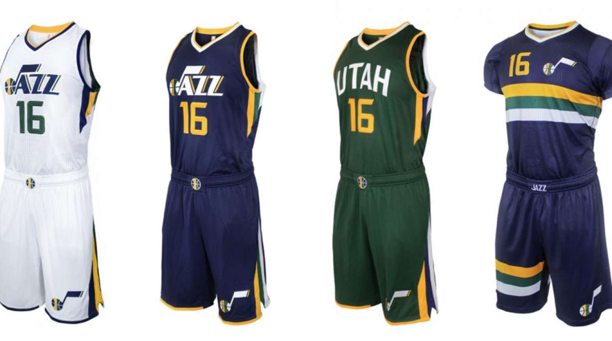
These jerseys could have been lumped in with the current jersey selection because the road and home jerseys are identical. But the new crop features a Nike logo on the right shoulder.
But outside the traditional home and road jerseys, the Jazz's two alternate jerseys those years were lacking. The first alternate was a green jersey that featured the word Utah across the front rather than the team’s note logo. Simply put, it was too bland when compared to the home and road jerseys.
The second alternate, deemed the pride jersey, went away from the traditional tank top jersey cut and added sleeves to resemble a T-shirt. Frankly, despite the novelty of the T-shirt cut, the design itself featuring a gold, green and white stripe across the midsection was too boring to even be considered gimmicky.
2004-2010
For these to be the worst jerseys in team history is probably a good sign for the franchise, that to this point have mostly avoided a truly bad era of jerseys. This era was the second iteration of the mountain logo, with a new color scheme featuring navy, powder blue, purple and white.
The navy blue uniform with the powder blue “Utah” on the front is a strong jersey, and actually one of the better overall uniforms in Jazz history. But its simplicity was less unique because of the all-too-bland white home jersey with navy blue lettering and a miserable baby blue alternate reimagining of the previously-maligned black and copper alternates from 1998.
These jerseys aren’t awful, but they offer almost nothing in terms of the team's history or to the unique landscape of the state of Utah. To be fair to the Jazz, this was a particularly bland era for jerseys across the NBA, but what better time is there to stand out by being ambitious? These simply missed the mark.