- The University of Utah unveiled a new logo featuring interlocking red U's.
- The logo aims to unify health, academics, and athletics, boosting national reputation.
- Existing block U structures remain, while secondary logos and colors are introduced.
SALT LAKE CITY — It's only July — but 2025's already been a historic year at the University of Utah.
The state's flagship university is celebrating its 175th birthday and has, in recent months, announced plans to relocate the storied Jon M. Huntsman Center as part of a major campus makeover even while rolling out a new strategic plan dubbed "Impact 2030."
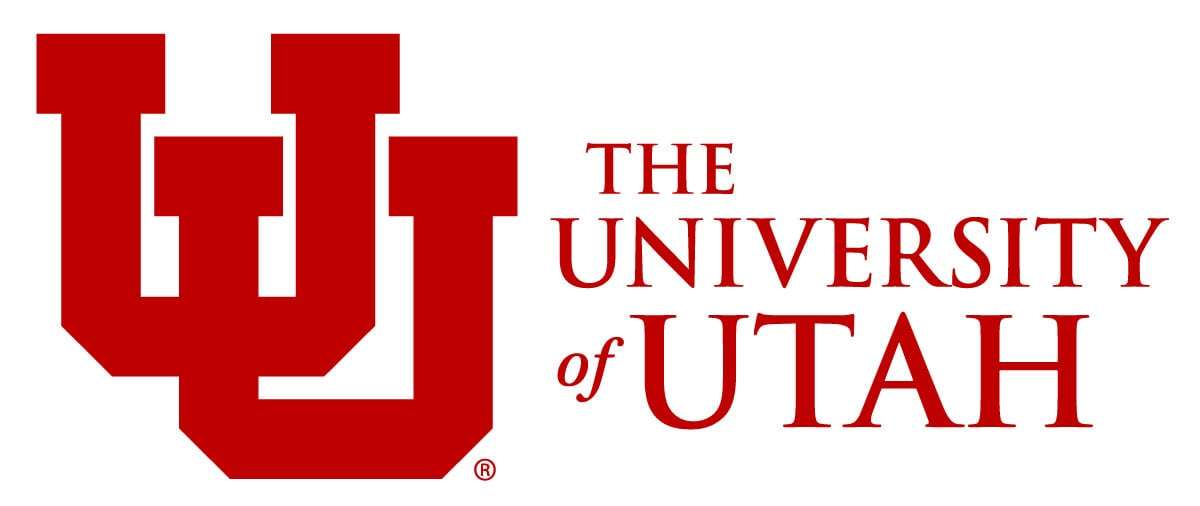
And now, the U. is unveiling a new institutional logo.
The new logo features a pair of red interlocking U's with an emphasis on Utah in its accompanying identifier — "The University of Utah."
The updated logo "represents an effort to connect University of Utah Health, academics and athletics into one all-encompassing image that will further boost the U's national reputation and support Impact 2030, the U.'s strategic plan," according to the university.
Hard-core Ute fans will immediately recognize the basic design elements of the new institutional logo.
It echoes the university's primary athletic logo that was introduced a decade ago.
"This logo refresh is part of our journey to be a top-10 public university because we are expecting to have a national and global reputation," said Chief Experience Officer Andrea Thomas.
"As we share this new logo across the country, it won't feel dramatically different because we have been very visible in athletics. This image better aligns with the awareness we already have."
So why is the University of Utah updating its logo?
More than a century ago, the University of Utah built the block U on the hill above campus. Since that time, the standalone U letter has become synonymous with the university.
Surveys reveal that the vast majority of Utah residents immediately associate the standalone U with the school.
"Outside of the state, however, the standalone U runs into competition from other institutions, such as the University of Miami, and brands like Unilever," according to the university release. "As the U. builds its national reputation, we are aiming to differentiate and distinguish ourselves as leaders in impact, health care, research and instruction — and the interlocking U institutional logo is a visual representation of that distinction."
But don't expect the standalone block U to entirely disappear.
The standalone block U logo on the mountain and other block U structures — such as the U by the Gardner Commons or the Campus Store — will remain the same.
"One way to think of this application is to consider that most people who are on campus, where the block U is featured prominently on banners and other permanent structures, will likely already be familiar with this image and its relationship with the University of Utah," according to the university.
Meanwhile, the secondary logos used by University of Utah colleges, divisions, departments, programs, units and services are not changing.
And the traditional "Circle and Feather" logo will continue to be used in Ute athletics — along with the primary interlocking U logo, according to Senior Associate Athletics Director for Strategic Communications Paul Kirk.
Other updates to the university's brand
With the updated logo, the University of Utah is also introducing a new primary color — Zion Cinder Cone — to its primary palette of red, black and white.
The University of Utah now has six secondary colors — including Salt Flat Grey and Granite Peak, which are shades of grey and blue.
"While the U. is looking to expand its reputation and awareness nationally, this logo change also supports the university's efforts to emphasize integration and collaboration across the institution as part of its strategic vision," according to the university.
"This logo represents the impact of the entire institution, including research, health, academics and athletics.

Most recent Education stories
Related topics
 Jason Swensen