Estimated read time: 2-3 minutes
This archived news story is available only for your personal, non-commercial use. Information in the story may be outdated or superseded by additional information. Reading or replaying the story in its archived form does not constitute a republication of the story.
SALT LAKE CITY — While the Utah Jazz's new logos leaked yesterday, that wasn't all the Jazz had in store. Thursday morning, the franchise released new jersey designs, tweaks to its current look and a new court design for Vivint Arena.
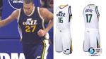
The Jazz will have four jerseys available next season: two small adaptations to their current home and away jerseys, a more significantly edited green jersey and the Jazz's first sleeved jersey design ever, an homage to old Jazz warmups back in the day.

The main home and road jerseys have been changed in only small ways. The side trim has been slimmed down and angled. The Jazz's number font now is more angular, matching the note's 66 degree angle. The front of the waistband now features the Jazz's small multicolored ball logo. The green alternate road jersey now reads "UTAH" in front.
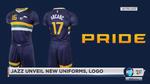
The "Pride" jersey, the Jazz's first sleeved jersey, is really bold, to say the least. It's an homage to the Jazz's warmups of the '80s, and features big yellow, green, and white striping across the middle. It honestly looks like a soccer jersey, but I suspect the look will be a popular one for fans. One thing's for sure: the Jazz didn't go boring with this look. A majority of NBA teams now have a sleeved jersey option.
A modern take on a classic look. pic.twitter.com/tkrphoOwpZ — Utah Jazz (@utahjazz) May 12, 2016
The court has also been significantly changed. The Jazz moved the "Jazz" note wordmark from center court and replaced it with a simpler ball design that more prominently features the center circle. The note logo now adorns a corner of either side of the court. The paint area is now entirely navy, replacing the green that [turned off some court observers](http://grantland.com/features/nba-court-design-power-rankings/).

As expected, the logos are what we thought: the Jazz wordmark is now the primary logo, and the secondary logo is now the circular multi-colored ball with "Utah Jazz Basketball" around the edges. The idea: get rid of the miscolored mountain logo that's been lurking around forever and replace it once and for all with the new look.

More than anything, these changes are a reflection of that desire: to consolidate and unify the Jazz's brand look, while giving fans some extra goodies in terms of jersey options and better merchandise. Designs with the Jazz's old primary mountain logo didn't sell well, but things with the note logo do. The fans spoke, and the Jazz listened.